Straat Consulaat UX Audit
UX research & advice report to improve the website
An estimated 32.000 people are homeless in the Netherlands, with approximately 5.000 residing in The Hague. Straat Consulaat is an organisation dedicated to ending homelessness in The Hague by collecting feedback from their supporters, including those with lived experience, and influencing local and national laws and regulations.
They recognized the need to improve their website to better achieve their goal, but were unsure of where to start. With diverse opinions among the team members, they remained in a state of inaction. So they requested a UX audit to kickstart their redesign project and turn opinions into insights.

UX Audit service
For the UX Audit my research covered 3 areas:
1. Google Analytics data scan
Based on data from Google Analytics, I analyzed high-level user behavior on the most crucial pages of the website.
2. Screen recording user insights
The Google Analytics data provided insight into where improvements could be made. By viewing screen recordings of visitors, I could see what people were doing there and identify the stumbling blocks. By following mouse movements, clicks and taps I gained an understanding into the issues they were experiencing.
3. UX best practices guidelines
I also navigated through the website to experience it for myself. The output of this was a list of insights and improvements per page based on UX guidelines.
Insight example 1:
Many information pages are not visited
The Straat Consulaat website offers advice, information and tips for homeless people, but it was disorganized with scattered information. In the Google Analytics data I discovered people did visit the main information page but it had a high bounce rate. The user recordings showed that visitors were not taking the time to read the text or find links to other pages. It’s unfortunate that many people now miss out on valuable information.
To make it easier for visitors to find more information (relevant for them) my recommendation is to:
- Provide access to the most important topics on the main information page (make it a hub).
- Add a scannable “step-by-step guide” for people who have recently become homeless
- Cluster key information in groups with links to additional pages, such as ‘benefits & administration,’ ‘housing’ and ‘aid & support.’
- Show relevant news items (for the homeless target audience)
- Bundle additional tips and information in collapsed FAQ elements.


Insight example 2:
News articles play a significant role on the website
Out of a total of 90.000 pageviews (in 2022), the top 10 news categories with the most articles already account for 40.000 pageviews. And the site has a total of 40+ news categories. This draws a lot of visitors to the site, so news is important! However, the current emphasis of the website’s navigation is only leading to informational pages. The news overview page is very difficult to find and is missing as a menu item. There are also too many news categories, making it difficult to find targeted news.
The high interest in news articles made it clear that we need to focus on optimizing that user journey and improve the design of the article page. So in the recommendation report I added wireframes for a new optimized article page layout and other navigational elements to enhance the experience for the ‘news readers’.
Example page from the UX audit research report:

Example page from the UX audit research report:

The benefits of a UX audit
In the recommendations report I included quick-wins that are relatively easy to implement and ‘big-wins’ that require more development effort. It’s very rewarding to see that after one week some changes were already implemented on the website.
To make the bigger proposals concrete the report also contains wireframe concepts to clarify what the big-wins could look like.
The UX audit report:
- Provides a concrete list of tangible and data supported improvements for your website.
- Clarifies where quick fixes can be applied and where larger changes are needed.
- The quick fixes give you a kickstart into action.
- It eliminates disagreement within the team. Opinions fade into the background and it motivates people to move forward.
Are you interested in getting a UX audit for your website?
Other UX projects
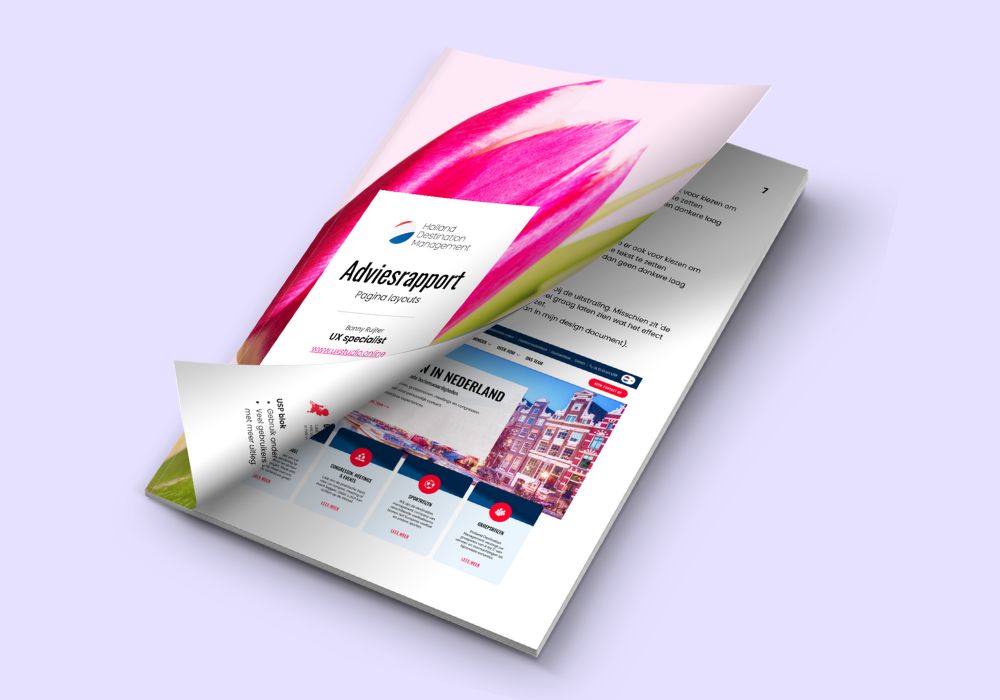
Holland-DM UX Audit
UX Audit where my research was focussed on usability findings and content evaluation.
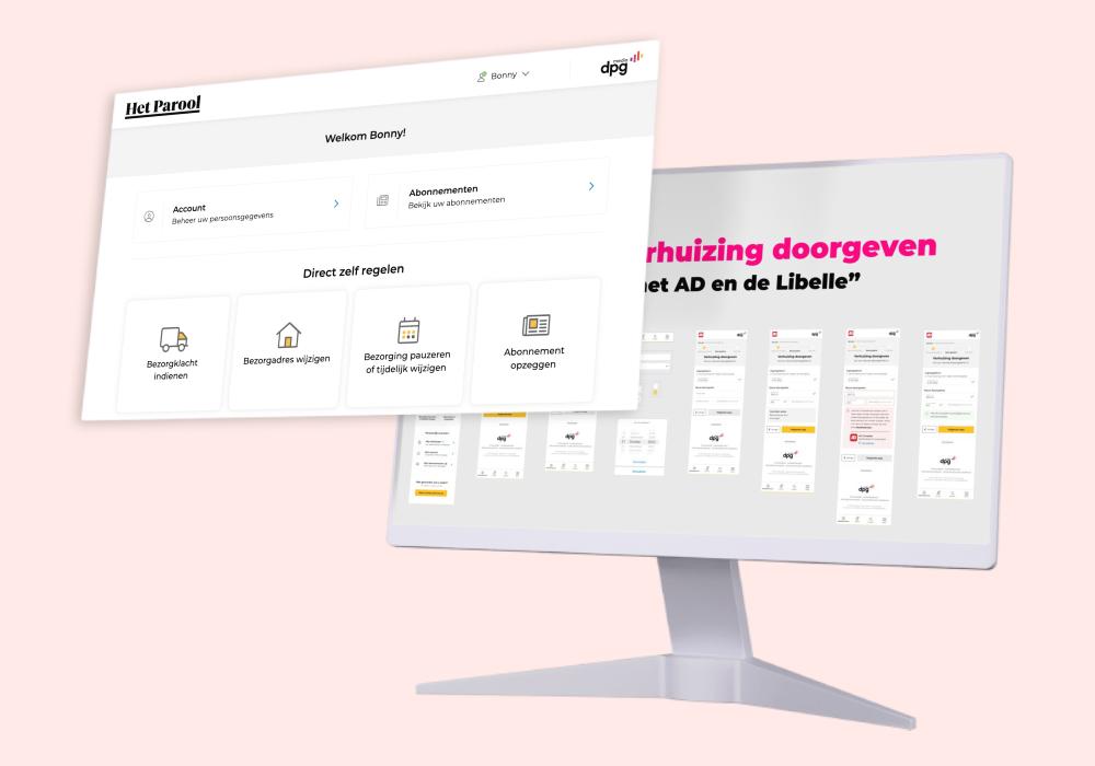
DPG Media UX Freelancer
Designing a new self-service platform that connects multiple profiles, subscriptions, and operates for 30+ magazines and newspapers.
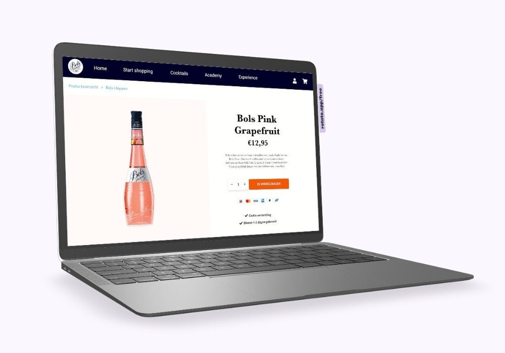
Lucas Bols e-com UX
UX audit + UX design: E-commerce wireframe designs based on data research, user recordings and e-commerce best practices.
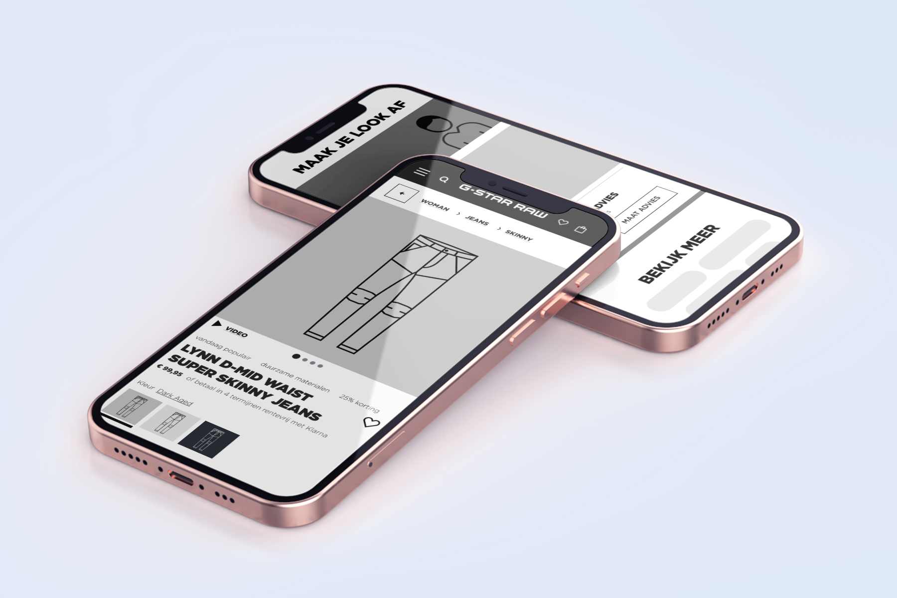
G-Star RAW UX freelancer
Hypothesis > UX design > User Testing > Design iteration > A/B testing > Conversion optimization.
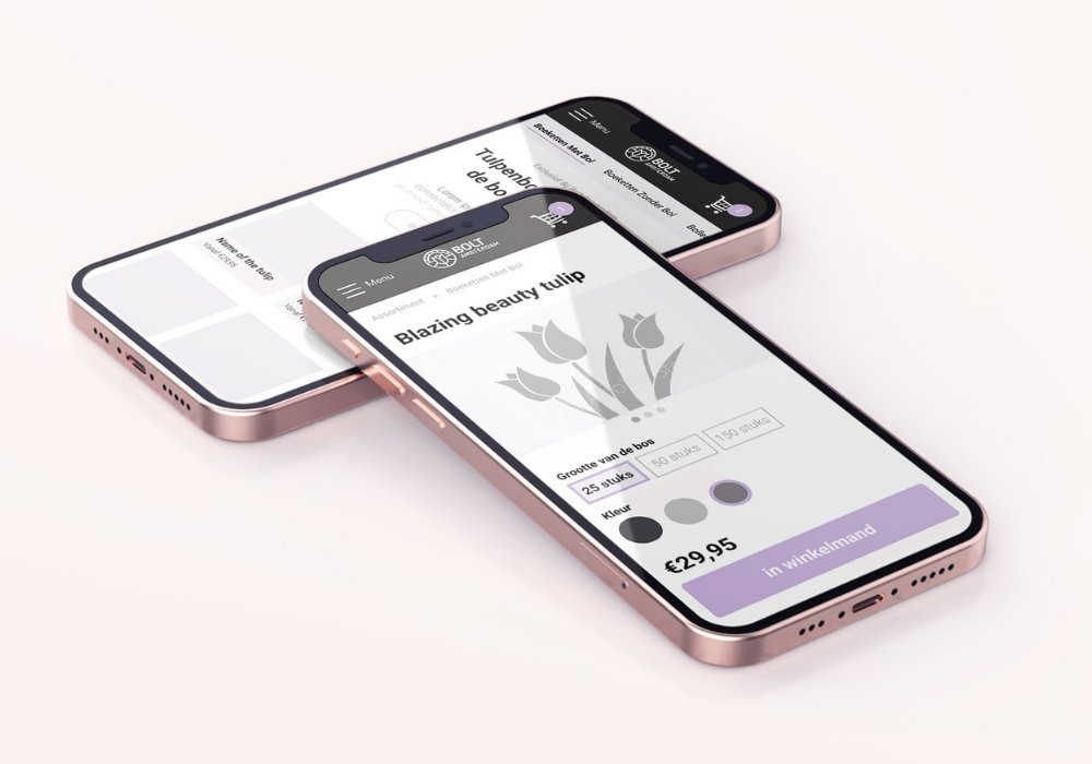
BOLT Amsterdam tulips webshop UX
What comes first, the tulip or the bulb? I had the assumption that people would mainly be interested in the shape and color of the tulip. But I was wrong…
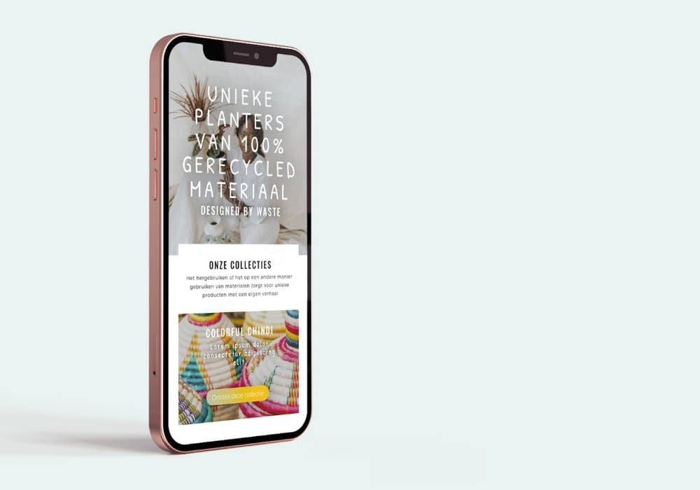
2nd Plan(t) webshop UX
Buying plants with a twist: This user journey starts with finding the planter (pot) you like and thén choosing a plant.
Do you have a UX question or potential project in mind?
GET IN TOUCH
Set up a free Zoom-call to tell me about your UX wants & needs
Do you have a UX question or potential project in mind?
GET IN TOUCH
Set up a free Zoom-call to tell me about your UX wants & needs