Holland Destination Management UX Audit
They knew their website could be better but didn’t know how or where to start.
HDM has lots of years of experience in incentive travel and event planning. They create tailored and memorable travel experiences for their clients and their guests. Their objective was to enhance their website to better align with their customer’s needs, especially the growing interest in information about sustainable options.
Additionally, they aimed to prominently showcase their creativity. Although HDM consistently received customer feedback expressing amazement at the creative experiences they organized, their website did not effectively convey this.

UX Audit focus points
The research for HDM was focussed on:
Usability Findings: By analyzing user recordings and heatmaps I found patterns and highlighted usability issues and pain points that users encountered when visiting the website. The insights let to an optimization of the navigation, forms, buttons, and other elements that affect the ease of use.
Content Evaluation: HDM aimed to convey their dedication to both creativity and sustainable practices. Evaluating the website’s content, including its relevance and sometimes shortcomings (of imagery), revealed the areas in need of enhancement. The report suggests improvements to content structure, titles, subtitles and new types of content.

Expert Review example:
The top of the homepage is your digital storefront
Data showed that many people entered the website through the homepage. When reviewing the top of the homepage the things to improve are:
- The readability of the text on the background image.
- Make the text more scannable by summing up USP’s in 3 bullets.
- The title is a bit broad/random, I’ve seen similar titles at competitor websites. Add a sub-slogan and tell about the creativity .
- The image should convey the beauty of The Netherlands but it’s a bit ‘dark’.
- Data showed the high interest in ‘meeting the team’. Add a link to that page above the fold (give the users what they’re looking for).
- The main call-to-action color is a bit old-fashioned (brown-red) and should catch the eye more. Freshen it up by brightening the red color.
- Provide clear links to pages where you talk about creativity and sustainability. (I put them in a secondary header above the menu because they should not clutter the main menu that is focussed on the primary user journey.

Data & screen recordings insight example:
Visitors want to ‘meet the team’
A large number of website visitors were consistently visiting the ‘Our Team’ page. The recordings and heatmap confirmed that visitors were scrolling up and down to see all of the employee’s photos. They were clearly interested in the team’s human aspect.
Problem: But, the recordings and heatmap also showed that quite some people didn’t click on ’the right things’. Some users would click on the photo’s, but that didn’t trigger anything. To read a short bio about a team member, the user needed to specifically select the plus-icon.
The fact that people are clicking, means they want to engage more with the content. But they didn’t get anything in return. This is a missed opportunity to increase engagement.
Quick fix: Make the whole image and name of the team member clickable. And: add a call-to-action that says ‘More about me’ to prompt more user to interact.
Bigger change:
- Show the team member’s specialization (in tags) so users know better who to contact for more information about a specific service.
- Show a bit of personal introduction text underneath the photo (instead of hiding it all in a pop-up) to make users more curious about their story.
- Put the photo and intro text a ‘card design’ to emphasize the clickability even more. Make the whole card clickable.
- Put the plus-icon in the right top of the card (and brighten the main-call-to-action color), so it stands out more.
As straightforward as some solutions may seem in hindsight: it’s due to analyzing heatmaps and screen recordings that these simple and easy-to-fix improvements come to light.
Are you also ready to improve your website?
And this was just the tip of the iceberg
In the recommendations report I included many, many more quick-wins and designs that are relatively easy to implement and ‘big-wins’ that require more development effort but can also make more impact.
The UX audit report:
- Provides a concrete list of data supported improvements for your website.
- Clarifies where quick fixes can be applied and where larger changes are needed.
- Contains design improvements.
- Gives you a kickstart into action and trigger a positive motion within the team.
Find out what a UX audit can do for your website:
Other UX projects
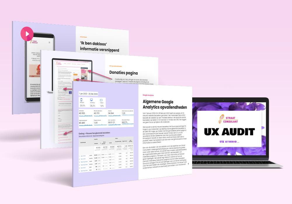
Straat Consulaat UX audit
A concrete list of improvements for their website based on Google Analytics data, screen recordings analysis and UX best practices.
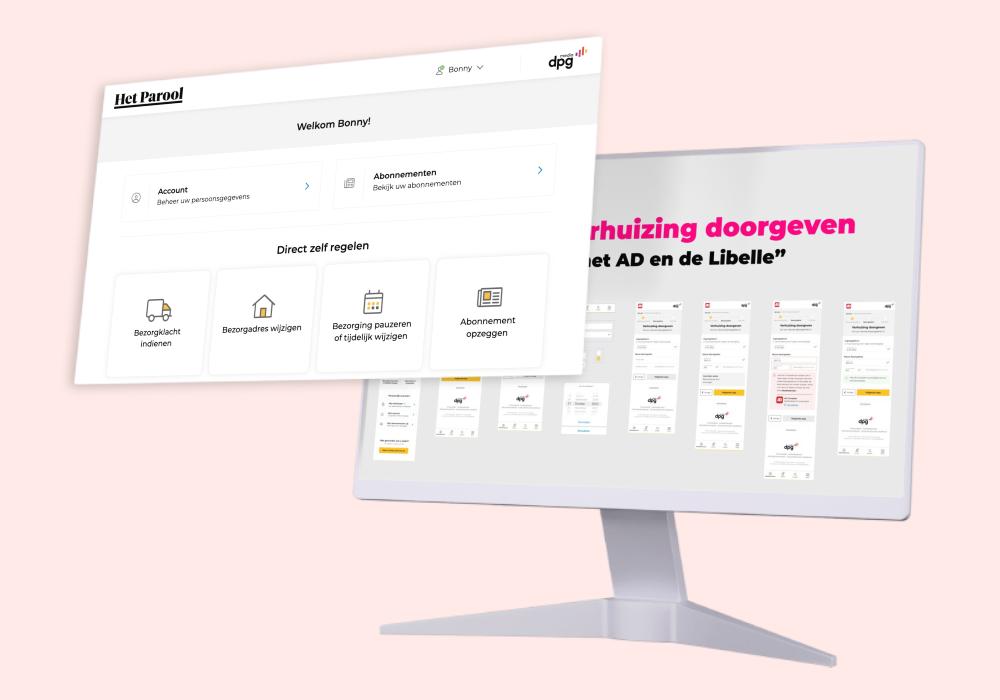
DPG Media UX Freelancer
Designing a new self-service platform that connects multiple profiles, subscriptions, and operates for 30+ magazines and newspapers.
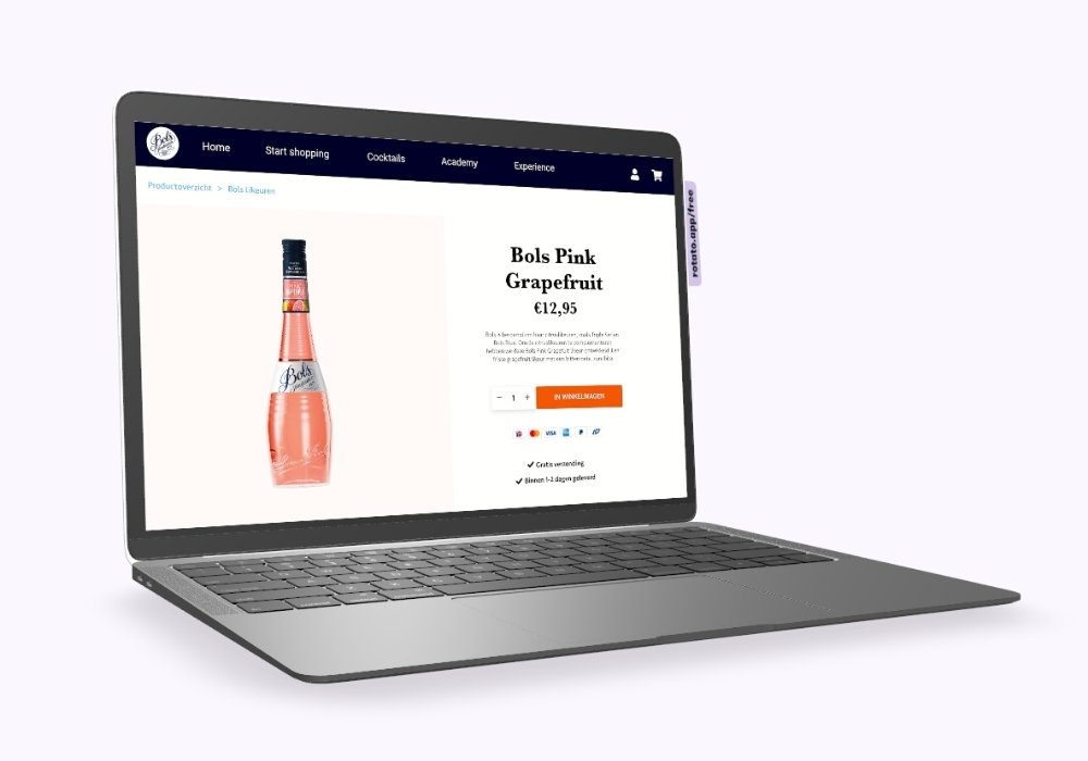
Lucas Bols e-com UX
UX audit + UX design: E-commerce wireframe designs based on data research, user recordings and e-commerce best practices.
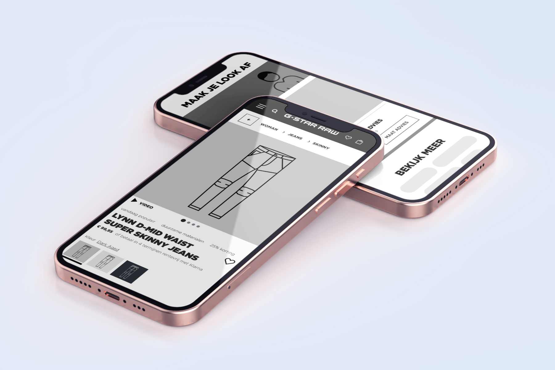
G-Star RAW UX freelancer
Hypothesis > UX design > User Testing > Design iteration > A/B testing > Conversion optimization.
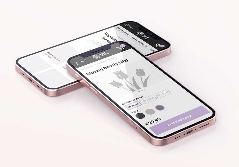
BOLT tulips webshop UX
What comes first, the tulip or the bulb? I had the assumption that people would mainly be interested in the shape and color of the tulip. But I was wrong…
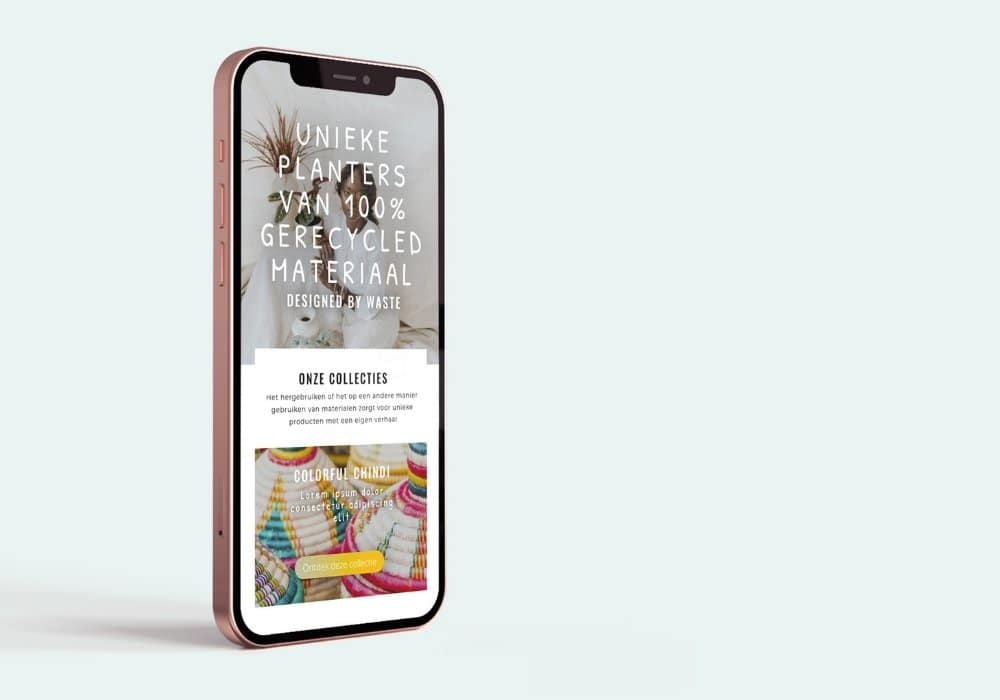
2nd Plan(t) webshop UX
Buying plants with a twist: This user journey starts with finding the planter (pot) you like and thén choosing a plant.
Do you have a UX question or potential project in mind?
GET IN TOUCH
Set up a free Zoom-call to tell me about your UX wants & needs
Do you have a UX question or potential project in mind?
GET IN TOUCH
Set up a free Zoom-call to tell me about your UX wants & needs