Bols Genever
Wireframing the perfect webshop and check-out
Bols, founded in 1575 in Amsterdam, conquered the world with its genever. Now in 2021 they’re expanding their territory even more and position themselves as the world’s first cocktail brand.
Time for a new online shop! With way more emphasis on ready-to-drink cocktails, cocktail ingredients, the craftsmanship & mixology, cocktail moments and a fully optimised e-commerce experience.
E-commerce wireframes
Based on data research, user recordings, e-commerce best practices and business goals of Bols, together with digital creative agency Raevels I did the UX design for the:
- Homepage
- Campaign landing pages
- Cocktail moment pages
- Category overview pages
- Lister page (+ filter)
- Product detail pages
- Add to cart notification
- Cart (basket)
- Check out flow
- Errors & edge cases
An overview of (most of) the wireframes in InVision

The full cocktail experience
The new shop puts way more emphasis on the experience of ‘drinking a cocktail’. The product detail page played a key role in this because that is the page where many visitors entered the website and where someone has to become enthusiastic and convinced to add the item to their cart.
Since showing a static picture of a liquor bottle, doesn’t convey any FEELING to the website visitor, I wanted to put way more emphasis on the ingredients, craftsmanship / mixology and the ‘end result’ that a bottle could deliver: the experience of drinking a cocktail in real life.
Cocktails have a luxury feel to them. When you order something from the online shop you need to be able to picture yourself having a nice drink with friends.
And to complete the experience: you can now easily order a fancy glass to drink it from! Make it sexy!
Get inspired and find your flavor
In the UX design I optimised the navigation structure, made it easy to visit multiple pages and made sure there are no ‘dead-ends’ for the user.
The empty basket state ‘seduces’ to continue shopping, on mobile I introduced a sticky secondary menu and at the bottom of product pages users can visit different sections.
In the quest of finding a cocktail flavor that fits your taste, I optimised the filters and made it possible to easily refine the products based on flavor by already showing those options on the page.

Visual design and implementation done by Story of AMS

The project process
I executed this project in collaboration with Raevels.nl. The steps we took were:
- UX Research (Analytics, user recordings, etc.)
- Defining the structure framework.
- UX design
- Mobile and desktop wireframes + specifications
Raevels and the UX studio.online join forces to help businesses successfully bring a new product to market or stay ahead of their competition with an online re-design. Stay relevant by improving your brand strategy, business positioning, concept strategy and digital strategy.
We look beyond the user journey to discover new and creative ways to make a positive impact on your customer. Get in touch to see what we can do for your company.
Visual design and implementation done by Story of AMS

Other UX projects
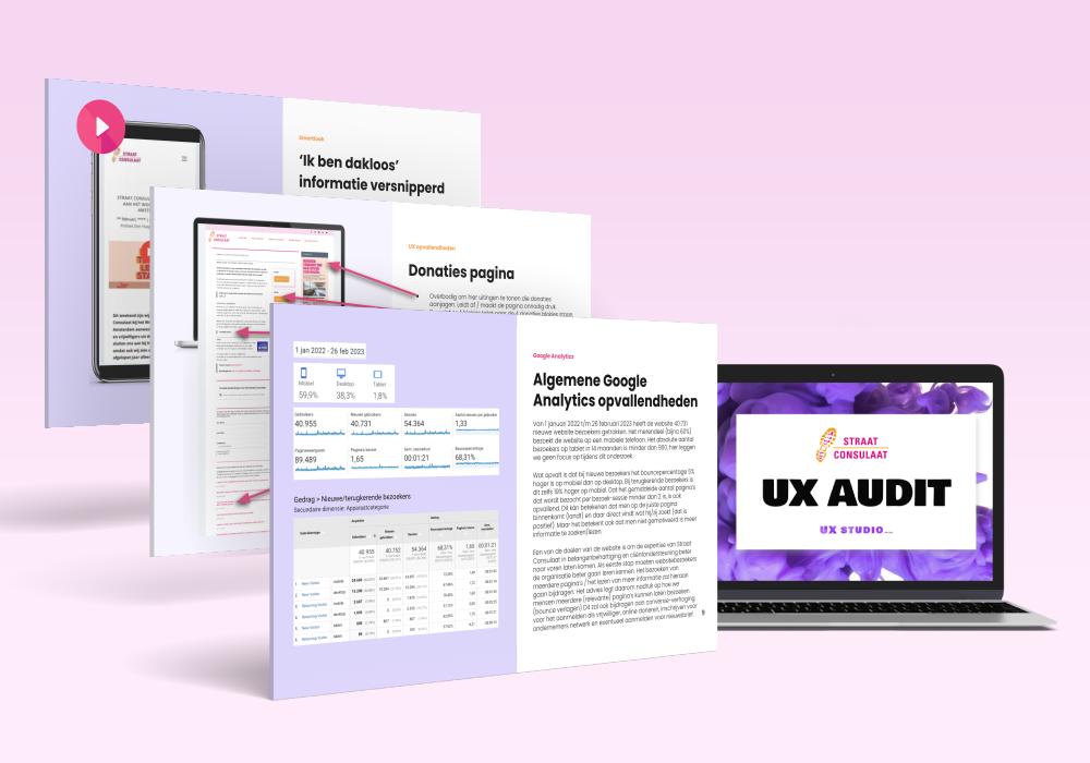
Straat Consulaat UX audit
A concrete list of improvements for their website based on Google Analytics data, screen recordings analysis and UX best practices.
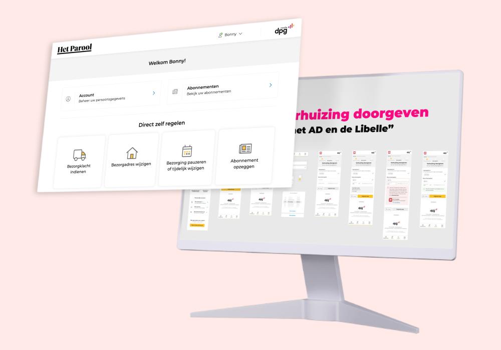
DPG Media UX Freelancer
Designing a new self-service platform that connects multiple profiles, subscriptions, and operates for 30+ magazines and newspapers.
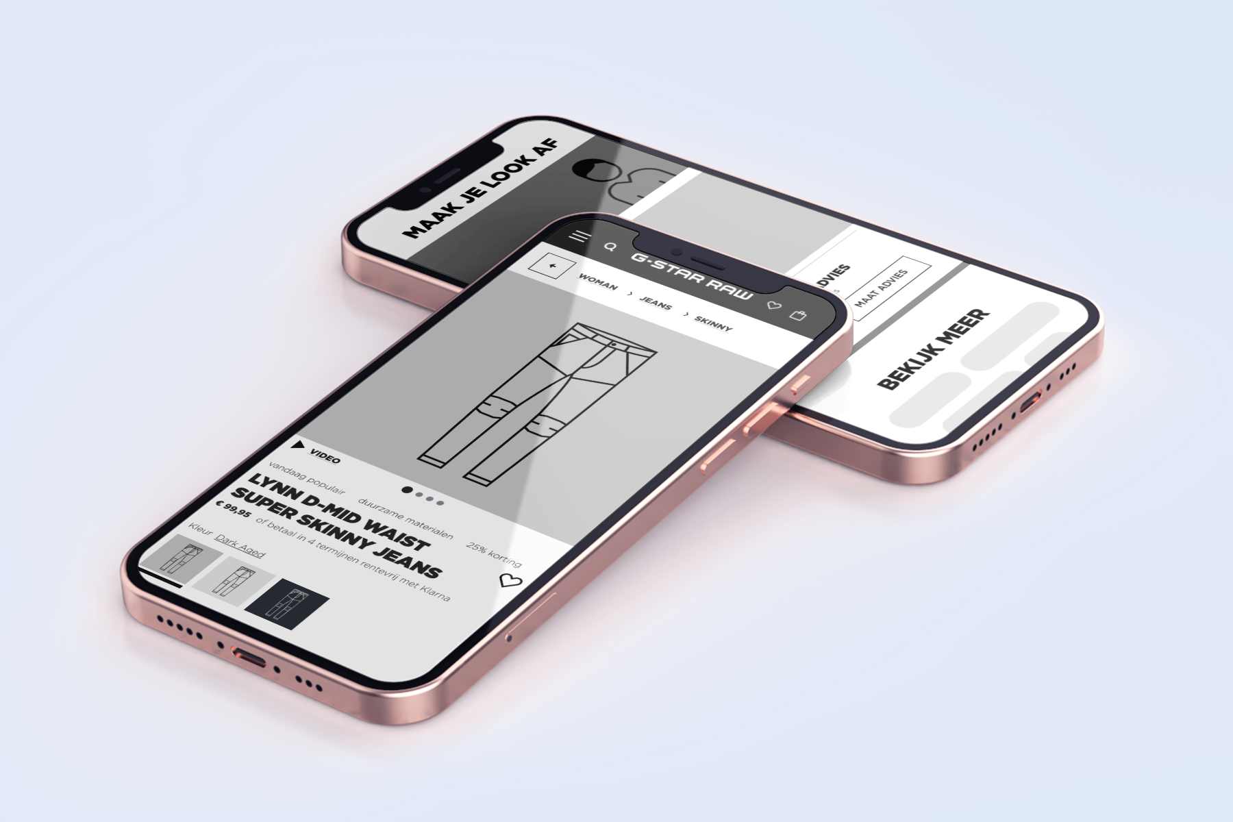
G-Star RAW UX freelancer
Hypothesis > UX design > User Testing > Design iteration > A/B testing > Conversion optimization.
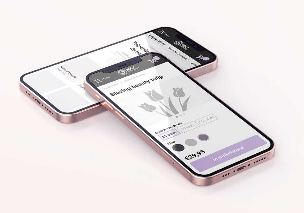
BOLT Amsterdam tulips webshop UX
What comes first, the tulip or the bulb? I had the assumption that people would mainly be interested in the shape and color of the tulip. But I was wrong…
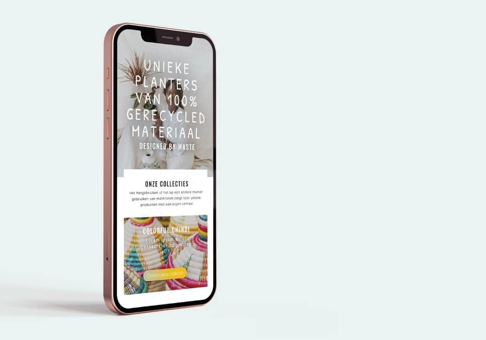
2nd Plan(t) webshop UX
Buying plants with a twist: This user journey starts with finding the planter (pot) you like and thén choosing a plant.
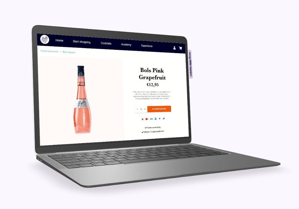
Lucas Bols e-com UX
UX audit + UX design: E-commerce wireframe designs based on data research, user recordings and e-commerce best practices.
Do you have a UX question or potential project in mind?
GET IN TOUCH
Set up a free Zoom-call to tell me about your UX wants & needs
Do you have a UX question or potential project in mind?
GET IN TOUCH
Set up a free Zoom-call to tell me about your UX wants & needs