G-Star RAW
A freelance UX design assignment
At G-Star I worked in close collaboration with the PO’s, conversion team and my fellow UX/UI designers. My main focus was on the redesign of the product detail page where a big part of the UX- and conversion team workflow consisted of continuous A/B testing based on former test insights, data and assumptions. The UX team was also applying a full UI change and was in the process of setting up a design system.
Due to confidentiality this page only shows a very high-over impression of my work. If you’re interested in hiring me as a freelancer and want to know more about my experience, tasks and accomplishments at G-Star: arrange a video-call with me.


The process
I worked for G-Star for over a year and explored multiple design solutions for (assumed) user problems and goals. I often validated the first chosen directions through quick tests in tools like UsabilityHub or UserZoom. When the proposed designs entailed more elaborate changes or impacted bigger chunks of the journeys, I created prototypes and conducted moderated qualitative user tests (partly in-person, partly online) where the participants carried out multiple assignments and I would have in-depth conversations about their thoughts and experience.
Based on the user test outcomes I carried out UX design iterations and collaborated with the UI designer to reach a pixel perfect end-result. Then the design would go into development and the conversion team would A/B test our hypotheses. And this process would repeat itself. Based on the outcomes of the test we would iterate or pick up a new user problem / business opportunity.
A full-page redesign VS testing small chunks
When you focus on testing small design elements you can properly conclude what the impact of a certain change is. You don’t want to implement 3 massive changes and then not be able to define what caused the increase or drop in conversion.
But: for a cohesive user experience and UI design you also need to look at the bigger picture. Because when you continuously implement the little chunks that ‘win’ the A/B test, your page could end up looking like a carnival. So as part of our workflow we regularly took a step back to look at the overall page experience + look-and-feel and sometimes propose new design tweaks to the ‘winning’ elements to make the page feel balanced again.


The A/B test winners
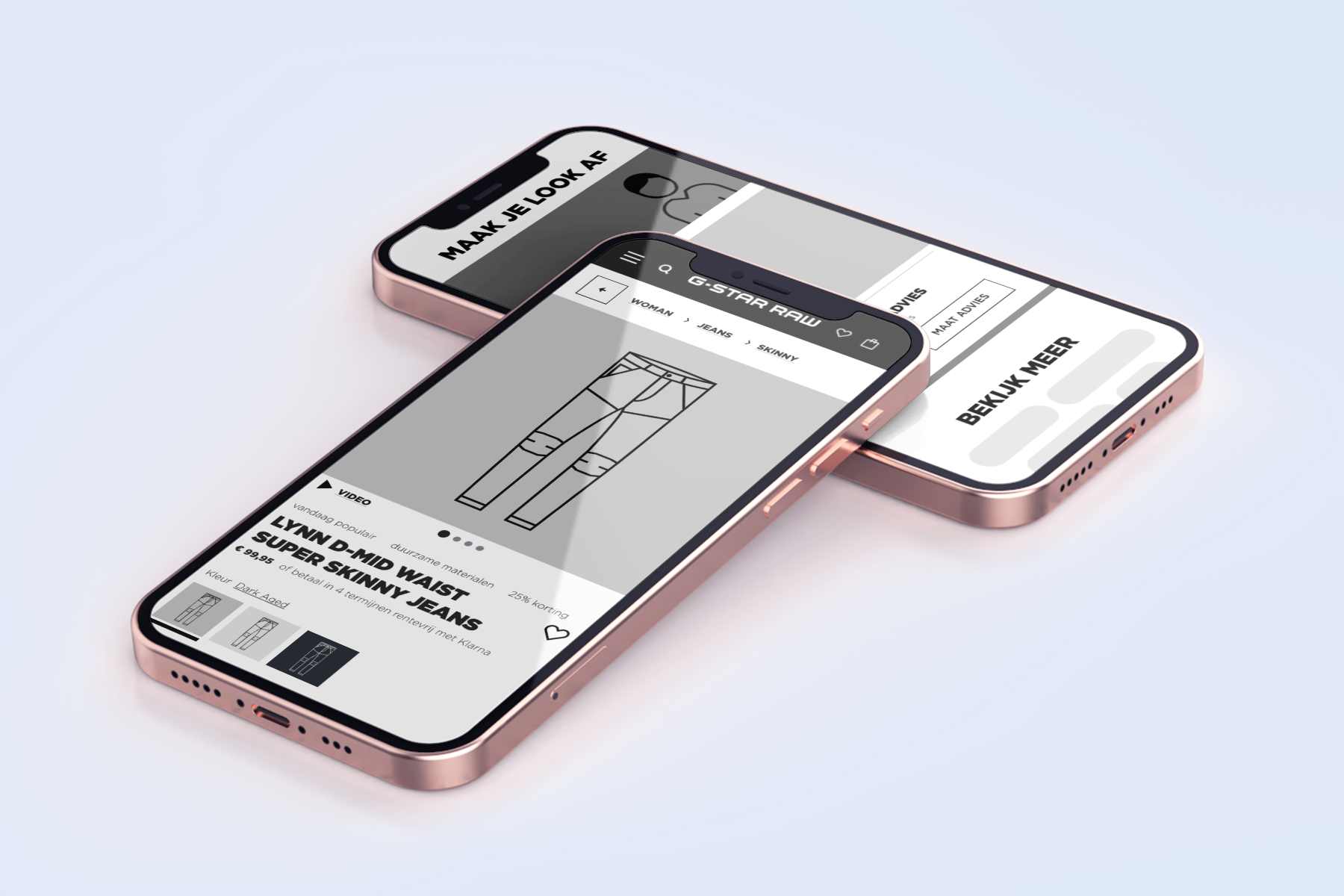
Within a year we executed quite a few A/B tests on the product detail page. Some design changes are already visible on the live website (they’re the winners of their test), others are still on the roadmap. What you can already see on the current (October 2022) G-Star product detail page VS the product detail page of October 2021 are the following changes:
- Breadcrumbs on the page.
- The product title is moved below the image.
- Product image will be larger (development is in progress).
- More emphasis on the size-help.
- By hiding the available sizes in drop-downs, it takes users (too much) effort to find out whether their size is available. Also: selecting waist, influences the available choices of the length and vice versa. So we show all sizes on the page.
- Showing items in a carousel so they take up less space making the user reach the similar items faster. It also allows the content team to show more than 4 items.
- All the product information is collapsed.
The A/B test winners
Within a year we executed quite a few A/B tests on the product detail page. Some design changes are already visible on the live website (they’re the winners of their test), others are still on the roadmap. What you can already see on the current (October 2022) G-Star product detail page VS the product detail page of October 2021 are the following changes:
- Breadcrumbs on the page.
- The product title is moved below the image.
- Product image will be larger (development is in progress).
- More emphasis on the size-help.
- By hiding the available sizes in drop-downs, it takes users (too much) effort to find out whether their size is available. Also: selecting waist, influences the available choices of the length and vice versa. So we show all sizes on the page.
- Showing items in a carousel so they take up less space making the user reach the similar items faster. It also allows the content team to show more than 4 items.
- All the product information is collapsed.
Let's work together to tackle your UX needs
As a freelance UX designer I can look at your product (website) with an objective eye and identify areas that can be improved to increase user satisfaction, retention, conversion rates and revenue. I’m driven to understand the way users interact with your website or webshop and love to be part of a motivated and proactive team.
I’m specialized in:
- Gaining insights into user behavior, using screen recording tools and analytics.
- Identifying bottlenecks and opportunities for improving conversion rates, using a data-driven approach to guide decision-making.
- Creating interaction designs and prototypes that are tailored to the needs and preferences of your target audience.
- Low-key usability-, explorative- and comparative user testing.
- Collaborating with the conversion team to keep optimizing for growth.
Other UX projects
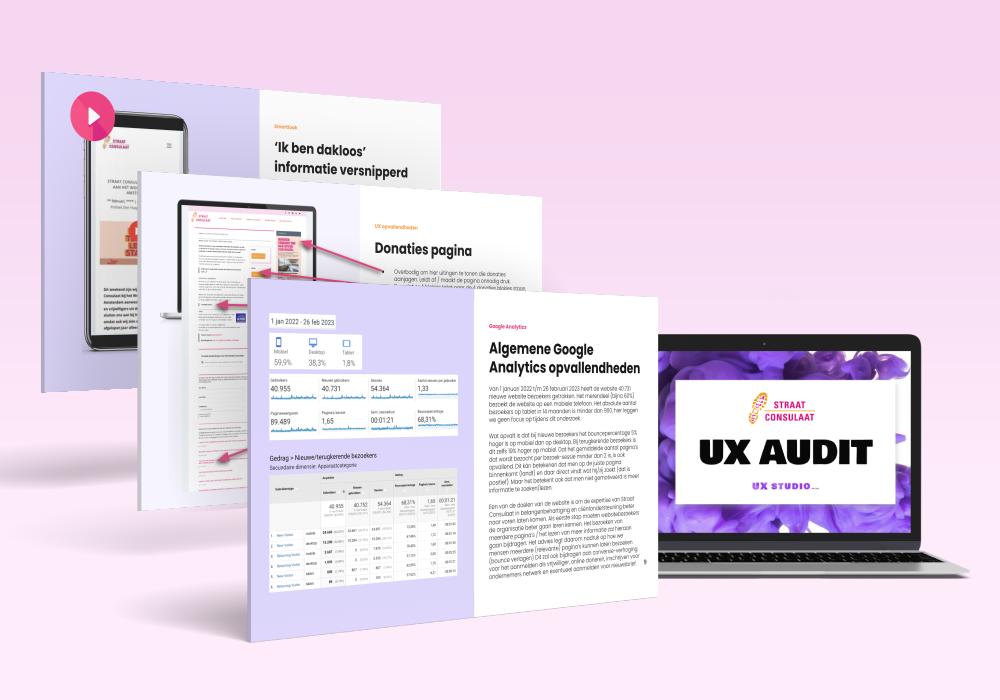
Straat Consulaat UX audit
A concrete list of improvements for their website based on Google Analytics data, screen recordings analysis and UX best practices.
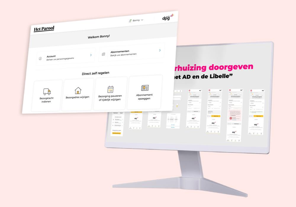
DPG Media UX Freelancer
Designing a new self-service platform that connects multiple profiles, subscriptions, and operates for 30+ magazines and newspapers.
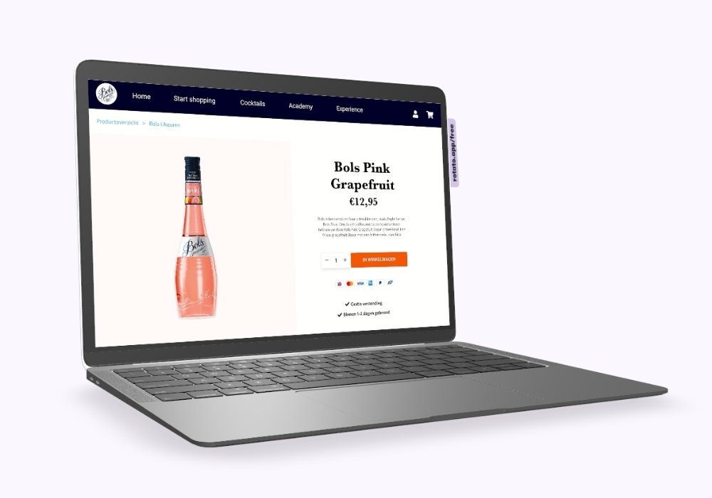
Lucas Bols e-com UX
UX audit + UX design: E-commerce wireframe designs based on data research, user recordings and e-commerce best practices.
G-Star RAW UX freelancer
Hypothesis > UX design > User Testing > Design iteration > A/B testing > Conversion optimization.
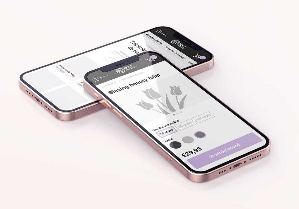
BOLT Amsterdam tulips webshop UX
What comes first, the tulip or the bulb? I had the assumption that people would mainly be interested in the shape and color of the tulip. But I was wrong...
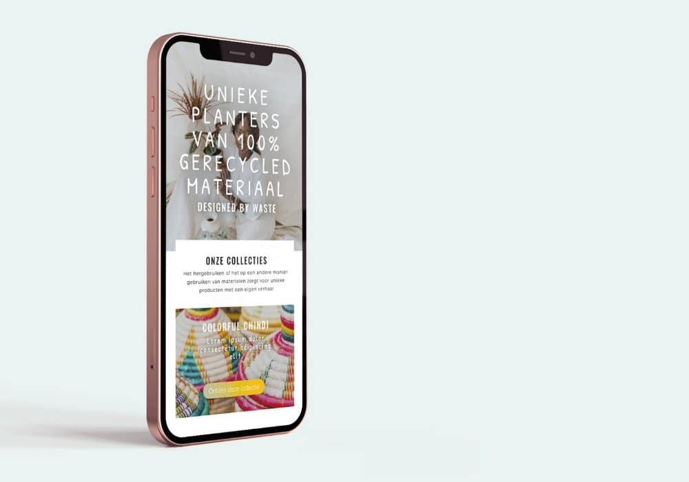
2nd Plan(t) webshop UX
Buying plants with a twist: This user journey starts with finding the planter (pot) you like and thén choosing a plant.
Do you have a UX question or potential project in mind?
GET IN TOUCH
Set up a free Zoom-call to tell me about your UX wants & needs
Do you have a UX question or potential project in mind?
GET IN TOUCH
Set up a free Zoom-call to tell me about your UX wants & needs